在設計網頁時為了不要讓圖片或色塊死板板的,有的人會傻傻的先用Photoshop上陰影再以圖片的格式上傳,今天我們直接為圖片和色塊加上CSS吧。
CSS實在有許多好用之處,今天要來跟大家介紹小編做網站時常常使用的CSS box-shadow!
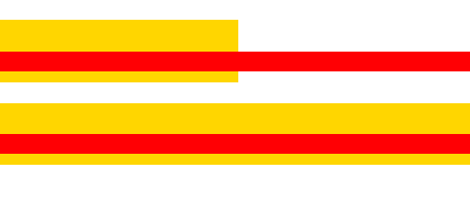
顏色從淺到深的陰影色塊
.card {
    background-color: #f5f5f5;
    border-radius: 2px;
    display: block;
    height: 300px;
    margin: 1rem;
    position: relative;
    width: 300px;
}
.card {
background-color: #f5f5f5;
border-radius: 2px;
display: block;
height: 300px;
margin: 1rem;
position: relative;
width: 300px;
}
.card-1 {
box-shadow: 0 1px 3px rgba(0,0,0,0.12), 0 1px 2px rgba(0,0,0,0.24);
transition: all 0.3s cubic-bezier(.25,.8,.25,1);
}.card {
background-color: #f5f5f5;
border-radius: 2px;
display: block;
height: 300px;
margin: 1rem;
position: relative;
width: 300px;
}
.card-2 {
box-shadow: 0 3px 6px rgba(0,0,0,0.16), 0 3px 6px rgba(0,0,0,0.23);
}.card {
background-color: #f5f5f5;
border-radius: 2px;
display: block;
height: 300px;
margin: 1rem;
position: relative;
width: 300px;
}
.card-3 {
box-shadow: 0 10px 20px rgba(0,0,0,0.19), 0 6px 6px rgba(0,0,0,0.23);
}.card {
background-color: #f5f5f5;
border-radius: 2px;
display: block;
height: 300px;
margin: 1rem;
position: relative;
width: 300px;
}
.card-4 {
box-shadow: 0 14px 28px rgba(0,0,0,0.25), 0 10px 10px rgba(0,0,0,0.22);
}.card {
background-color: #f5f5f5;
border-radius: 2px;
display: block;
height: 300px;
margin: 1rem;
position: relative;
width: 300px;
}
.card-5 {
box-shadow: 0 19px 38px rgba(0,0,0,0.30), 0 15px 12px rgba(0,0,0,0.22);
}特殊陰影處理
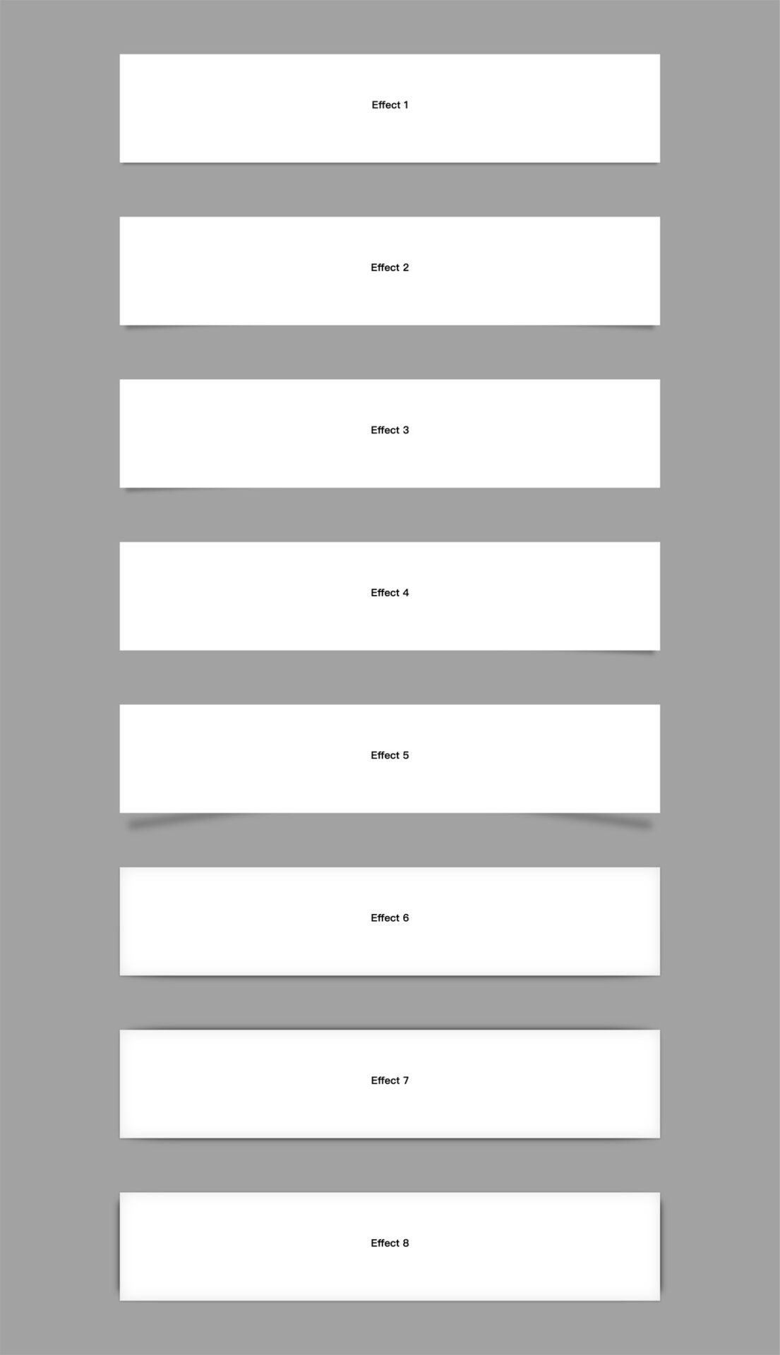
HTML
<div class="box effect1">
<h3>Effect 1</h3>
</div>

<div class="box effect2">
<h3>Effect 2</h3>
</div>

<div class="box effect3">
<h3>Effect 3</h3>
</div>

<div class="box effect4">
<h3>Effect 4</h3>
</div>

<div class="box effect5">
<h3>Effect 5</h3>
</div>

<div class="box effect6">
<h3>Effect 6</h3>
</div>

<div class="box effect7">
<h3>Effect 7</h3>
</div>

<div class="box effect8">
<h3>Effect 8</h3>
</div>
CSS
.box h3 {
text-align: center;
position: relative;
top: 80px;
}
.box {
width: 70%;
height: 200px;
background: #FFF;
margin: 40px auto;
}
/*==================================================
* Effect 1
* ===============================================*/
.effect1 {
-webkit-box-shadow: 0 10px 6px -6px #777;
-moz-box-shadow: 0 10px 6px -6px #777;
box-shadow: 0 10px 6px -6px #777;
}
/*==================================================
* Effect 2
* ===============================================*/
.effect2 {
position: relative;
}
.effect2:before,
.effect2:after {
z-index: -1;
position: absolute;
content: "";
bottom: 15px;
left: 10px;
width: 50%;
top: 80%;
max-width: 300px;
background: #777;
-webkit-box-shadow: 0 15px 10px #777;
-moz-box-shadow: 0 15px 10px #777;
box-shadow: 0 15px 10px #777;
-webkit-transform: rotate(-3deg);
-moz-transform: rotate(-3deg);
-o-transform: rotate(-3deg);
-ms-transform: rotate(-3deg);
transform: rotate(-3deg);
}
.effect2:after {
-webkit-transform: rotate(3deg);
-moz-transform: rotate(3deg);
-o-transform: rotate(3deg);
-ms-transform: rotate(3deg);
transform: rotate(3deg);
right: 10px;
left: auto;
}
/*==================================================
* Effect 3
* ===============================================*/
.effect3 {
position: relative;
}
.effect3:before {
z-index: -1;
position: absolute;
content: "";
bottom: 15px;
left: 10px;
width: 50%;
top: 80%;
max-width: 300px;
background: #777;
-webkit-box-shadow: 0 15px 10px #777;
-moz-box-shadow: 0 15px 10px #777;
box-shadow: 0 15px 10px #777;
-webkit-transform: rotate(-3deg);
-moz-transform: rotate(-3deg);
-o-transform: rotate(-3deg);
-ms-transform: rotate(-3deg);
transform: rotate(-3deg);
}
/*==================================================
* Effect 4
* ===============================================*/
.effect4 {
position: relative;
}
.effect4:after {
z-index: -1;
position: absolute;
content: "";
bottom: 15px;
right: 10px;
left: auto;
width: 50%;
top: 80%;
max-width: 300px;
background: #777;
-webkit-box-shadow: 0 15px 10px #777;
-moz-box-shadow: 0 15px 10px #777;
box-shadow: 0 15px 10px #777;
-webkit-transform: rotate(3deg);
-moz-transform: rotate(3deg);
-o-transform: rotate(3deg);
-ms-transform: rotate(3deg);
transform: r[......]