
也不知道為什麼更新win10後,小紅傘一職跳出下面訊息
Avira antivirus 需要更新,avira antivirus 偵測到 windows 10 更新…
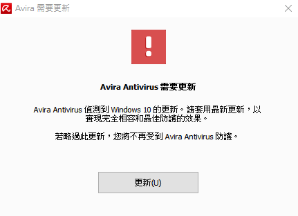
雖然似乎不影響功能,但每次開機都跳,覺得煩
網路上有些解決方法,但非官方解決方案,檔案裝起來有點不安,
怕開了道後門 ( 剛好發生第一銀行提款機被駭盜領事件 )
所以下面解決方法出自Avira官方文章
https://www.avira.com/zh-tw/support-for-home-knowledgebase-detail/kbid/1800
一、開啟Avira
二、停用Avira檔案保護
關閉「保護處理序,避免意外中止」項目。
關閉「保護檔案和登錄項目,避免操作」項目。
三、下載及安裝 Avira 註冊檔程式
下載官方檔案,下面載點是直接官網複製的連結
( 不放心的話可以連結官網該篇文章下載 )
載點:Win10UpdateMessage.zip解壓縮密碼:avira
檔案上按右鍵,以「系統管理員身分執行」
四、啟用Avira檔案保護
重新開啟剛才關閉的檔案保護功能
五、重新開機~OK
參考文章:
官方 Recurring Avira update message after each restart
https://www.avira.com/zh-tw/support-for-home-knowledgebase-detail/kbid/1800
小紅傘開機都會出現『avira antivirus 偵測到 windows 10 更新』http://www.mobile01.com/topicdetail.php?f=508&t=4650565
[……]


